How to Review a Digital Print Proof: A Publisher’s Checklist
Read Time 26 mins
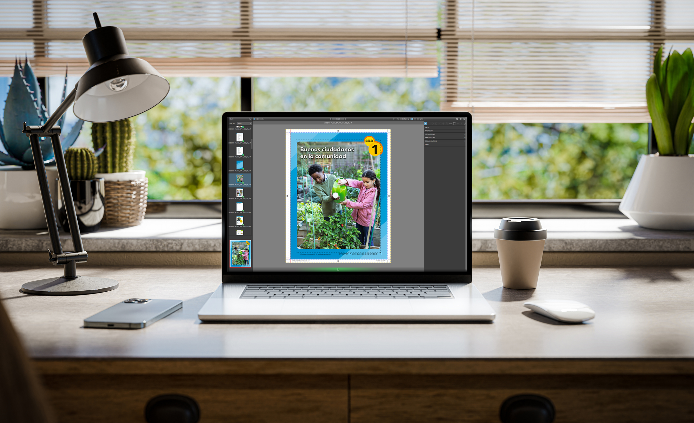
For many production managers and art directors, the digital proof is the last checkpoint before a project moves into production. It is also one of the most important moments in the process.
A digital proof is your opportunity to confirm that files, layout, pagination, and product specs are correct before plates are made or the job goes on press. The challenge is that many people reviewing proofs are looking at them from an editorial perspective only. They are checking text and images but not always reviewing a file the way a printer does.
This guide walks through the key areas publishers should review when approving a digital proof and what to ask if something does not look right.
First, understand what the proof is showing you
A digital proof is designed to represent how the file will appear in production. Depending on the workflow, it may show:
- Final page positioning
- Trim and bleed areas
- Spine calculations
- Color simulation
- Pagination and imposition structure
It is important to remember that a digital proof is not always an exact match to the final printed sheet. Monitor calibration, lighting conditions, and paper choice can all affect how color is perceived.
The goal is to confirm that the file is production-ready and aligned with expectations before manufacturing begins.
Start with the overall layout and pagination
Before zooming in on details, step back and review the book as a whole. Look for:
- Correct page order
- Missing or duplicated pages
- Blank pages where intended
- Correct front and back matter placement
This is also the time to verify:
- Consistent chapter openings and section breaks
- Running headers and footers
- Page numbering
- Table of contents alignment
Pagination issues are easier to fix now than after plating or printing.
Review trim size and bleeds carefully
One of the most common production problems comes from the trim and bleed setup. A bleed is any image or color element that extends beyond the trim edge so it prints cleanly after trimming. When reviewing the proof:
- Confirm all bleed elements extend properly beyond trim
- Make sure the critical text or graphics are not too close to the edge
- Check that the page margins feel consistent throughout the book.
A good rule is to keep important content safely inside the trim area whenever possible. For more information on bleed, trim, vs. safe area, read this post ⟶
Check image quality and placement
Images should be reviewed for both technical quality and positioning. Look for:
- Low-resolution images
- Unexpected color shifts
- Cropping issues
- Incorrect scaling
- Pixelation or softness
For educational publishing, also check:
- Charts and graphs
- Fine rules and tables
- Math equations and line art
These elements can sometimes reproduce differently from standard photography.
Evaluate color against expectations
Digital proofs often simulate the final color but they should still be reviewed thoughtfully. Focus on:
- Overall balance and consistency
- Flesh tones and neutral grays
- Saturation levels
- Brand or program colors
- Contrast in charts or educational graphics
Remember that color will ultimately interact with the final paper stock and printing process. If something feels noticeably off, ask your printer:
- Was the proof generated using the intended color profile
- Is this simulating the final stock and print condition
- Are there any out-of-gamut colors that may shift in production
Those conversations are normal and helpful.
Reviewing registration and trapping indicators
Even in a digital proof, registration and trapping should be reviewed where visible.
Registration
Registration refers to how accurately colors align during printing. Watch for:
- Misaligned color edges
- Halos around text to graphics
- Fine type reversing poorly from backgrounds
These issues may indicate file setup problems that should be addressed before production.
Trapping
Trapping compensates for slight movement between colors on press. In most modern workflows, trapping is automated but it is still worth checking:
- Small reversed text
- Thin rules
- Complex color transitions
If something looks questionable, ask whether the trapping has been optimized for the press or substrate being used.
Verify spine text and cover layout
Covers deserve extra attention because small errors become highly visible once bound. Check:
- Spine width calculations
- Spine text centering
- Barcode placement
- Safe areas near hinges or folds
- Alignment between the front cover, spine, and back cover
Spine width is especially important because paper choice and page count affect final thickness. Even a small change in stock can shift the spine positioning.
What to ask when something looks wrong
If something feels off, do not assume it will fix itself on press. Good questions include:
- Is this an issue with the file or the proofing process
- Will this appear differently on the final press sheet
- Was the proof generated to the correct trim and stock specifications
- Should we be concerned about trapping, registration, or image resolution
- Is this within normal product tolerance
A strong print partner should be able to explain what you are seeing clearly and confidently.
Proof review is a collaboration
The best proofing process is collaborative, not transactional. A printer’s prepress and production teams should help identify potential issues before they become expensive problems.
At Bradford & Bigelow, proof review is treated as a part of the production partnership, not just a sign-off step. The goal is to help publishers move into manufacturing with confidence and fewer surprises later in the process.
Key takeaways
Digital proofs are more than a visual check; they are a technical and production review point before manufacturing begins.
Taking time to evaluate layout, trim, bleed, images, color, spine setup, and binding details can prevent costly issues later. And when something does not look right, asking questions early is always better than discovering the issue after the job has been printed.
Print Readiness & Proof Review
File specs + publisher proof checklist — 22 items across two phases
File Format
Press-ready PDF with embedded fonts
All fonts must be embedded. Other formats may incur additional fees and processing time.
Color
Images are CMYK, Grayscale, or Pantone — not RGB
File color must match quoted colors. RGB images are not suitable for print.
Ink channels match job type
4-color: CMYK only. Black-only: no rich black or registration black. Spot colors only when quoted.
No ICC profiles
Color space must be native CMYK, black, or PMS. ICC-profiled files are not accepted.
Resolution
All images 300 DPI minimum
Web images at 72 DPI are not suitable for print and will cause noticeable quality loss.
Bleed, Safety & Trim
0.125" bleed on all edge artwork
Artwork going to the document edge must extend 1/8" beyond the trim line.
Critical elements 0.125" inside edge
Text, images, and logos must stay at least 1/8" from the trim edge to avoid cutoff during trimming.
Crop marks offset at least 12 points
If crop marks are present, they must be offset 12pt+ so they do not interfere with bleed elements.
Trim size matches quoted spec
Any deviation from the quoted trim size can result in unexpected margin differences.
Layout & Pagination
Page order and front/back matter correct
Check for correct page order, missing or duplicated pages, blank pages where intended, and proper front/back matter placement.
Running headers, footers, and page numbers
Verify consistent chapter openings, section breaks, running headers/footers, page numbering, and table of contents alignment.
Trim & Bleed (Proof View)
Bleed elements extend properly beyond trim
Confirm all bleed elements extend past trim, no critical content sits too close to the edge, and page margins feel consistent throughout.
Image Quality
No low-res, pixelated, or soft images
Review for low-resolution images, unexpected color shifts, cropping issues, incorrect scaling, or pixelation.
Charts, tables, equations, and line art
Educational elements can reproduce differently from photography. Check fine rules, math equations, and data tables with extra care.
Color Review
Overall color balance and consistency
Review overall balance, flesh tones and neutral grays, saturation levels, brand/program colors, and contrast in educational graphics.
No out-of-gamut colors that may shift
Color interacts with paper stock and the press. Ask B&B if the proof was generated with the correct color profile and stock simulation.
Registration & Trapping
No misaligned color edges or halos
Watch for misaligned color edges, halos around text or graphics, and fine reversed type reproducing poorly from backgrounds.
Trapping on small reversed text and thin rules
Even with automated trapping, check small reversed text, thin rules, and complex color transitions closely.
Cover & Spine
Spine width, text centering, and alignment
Spine width is driven by page count and paper stock. Verify spine text is centered and front cover, spine, and back cover align correctly.
Barcode placement and safe areas at hinges
Check barcode position and safe areas near hinges or folds. Small cover errors become very visible once bound.
Proofing Method
Proof type is appropriate for this job
Insite softproof is most accurate for interiors (ripped to press). Epson proof (G7-calibrated) is used for covers. PDF softproof is the least accurate — it does not show how the file will rip.
Ready to approve or submit corrections
If corrections are needed, AA re-prep starts at $50 (preflight) + $25 first page + $5.50 each additional. Epson reproof $15/page. Laser $0.50/page. Prepress hours $136.50/hr.